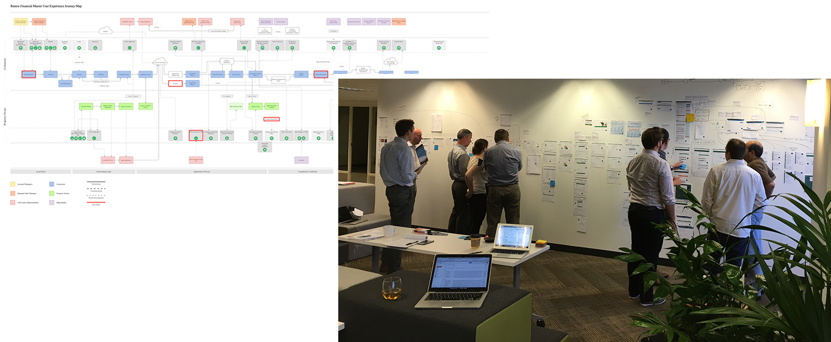
This project started after we had gone through a major rebrand and product offering change for the company. My team and I had redesigned the design system and nearly all parts of the product would be impacted, so it was decided to also try and fit in any usability improvements as we could, within reason. I had been working on an extensive user flow to identify pain points and areas of innovation in a customer’s lifecycle. We decided to take it to the company as a whole and I facilitated several workshops at our various locations across the west coast, which included representatives from sales, finance, legal, support, and others.

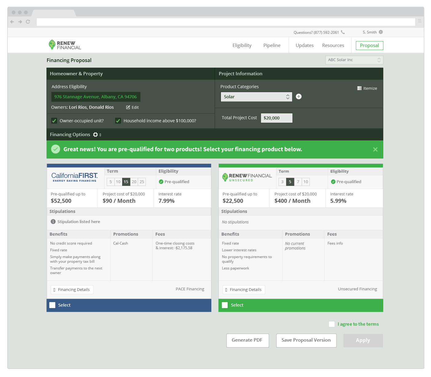
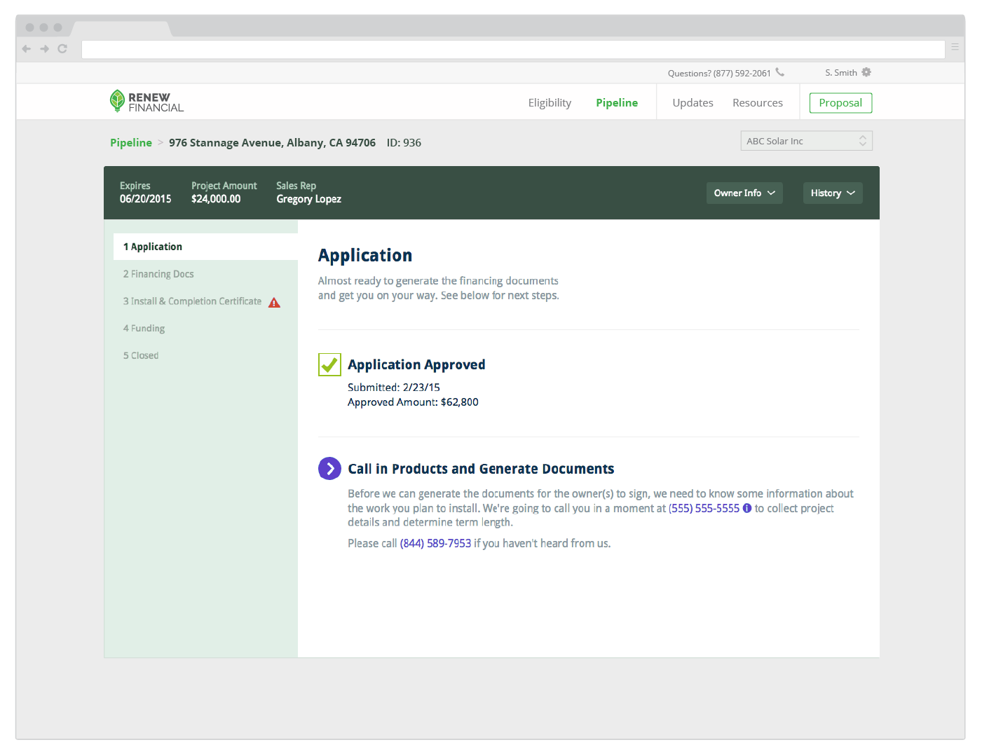
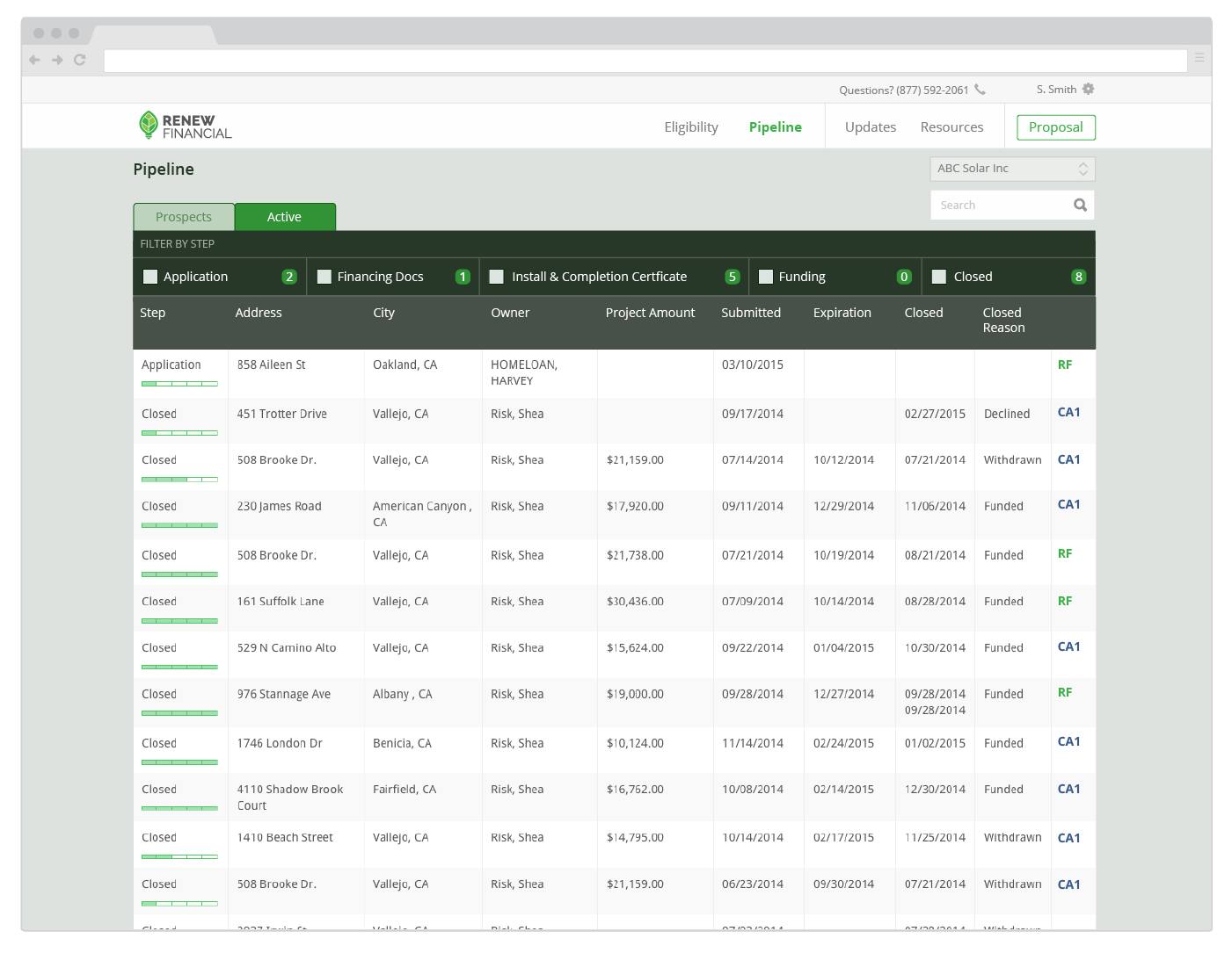
Eventually we were able to identify which areas users and the employees that supported them needed improvements. We wireframed several options, and after some initial iteration I built a high fidelity working prototype (AngularJS) and we hit the road (and video conference) and visited with solar sales and installers across California who used our products and did observations, interviews, ride-alongs, and user testing of the prototype. We iterated on the road and visited more until we came to what you will see below. This project kicked off several others, the largest being the redesign of the internal software that the call center and finance used to process applications. I gained so much respect for research and testing best practices and learnings in the fintech and solar industries while working on RenewFinancial’s products.


